Renewed strategy and visual identity
Recently, the insurance company “Aldagi” has re-emerged on the market with a new strategy and visual identity. The brand with a 33-year history has clearly expressed its contours. Today, “Aldagi” is a brand that will be associated with everyday peace of mind and overcoming fears for the consumer. It will be a reliable base that will help people cope with everyday fears. The renewed brand is both emotional and rational, reliable and hopeful. Along with the strategy, a new visual identity and campaign were created, with which “Aldagi” began to introduce the renewed brand to the public. Shota Chinchaladze worked on the brand strategy, the Holy Motors agency took care of the visual style, and the “The End is Good” campaign was created together with JWT Metro. Let’s get to know the story of the rebirth of the historical brand “Aldagi” together.
How was the Aldagi brand strategy formed?
Shota Chinchaladze: I have had professional contact with the insurance industry many times before, so working on such a different project was interesting for me. Our main task was to work on strategic rebranding. The Aldagi team had already carried out some work, but we had to fundamentally update the brand strategy. As part of the work, we defined three main pillars of the brand. On the one hand, we agreed on what the Aldagi brand experience should be. We clearly outlined the brand category and created a narrative arch at the level of verbal identity.
It is very interesting that the updated strategy naturally reflects the brand and the team. Aldagi has been an industry leader for 33 years and has a long history. It was the first to introduce the insurance industry to Georgia and has also made a significant contribution to this field at the legislative level. Such a long past also carries its own weight, and as a rule, it is quite difficult at this time to talk about a new strategic position with the company's already well-experienced employees and to obtain the necessary flexibility. However, to the credit of the Aldagi team, it must be said that the process was flexible and, in the end, quite productive.
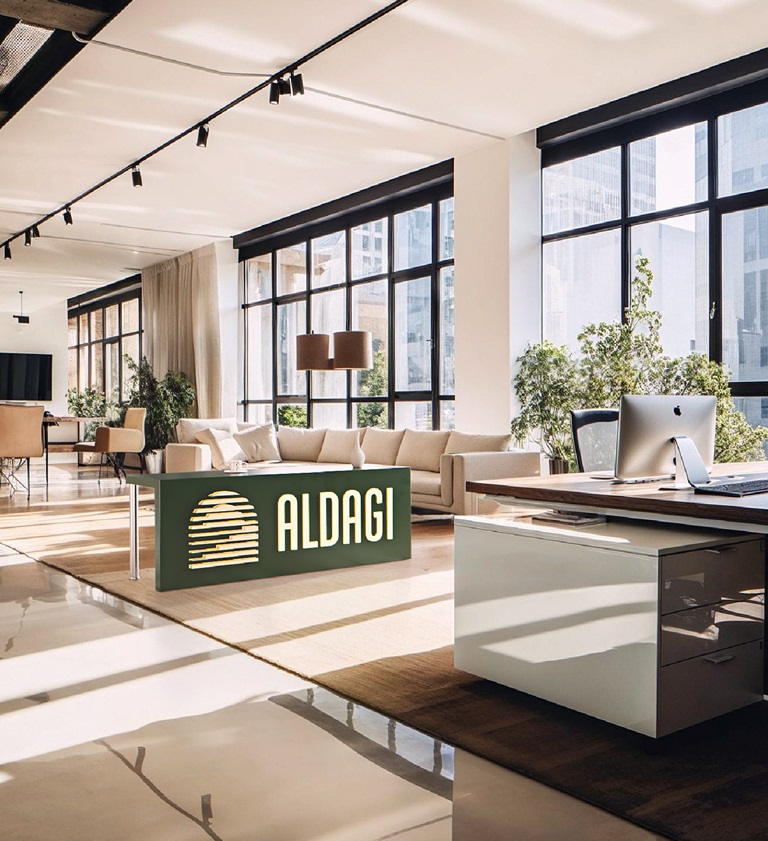
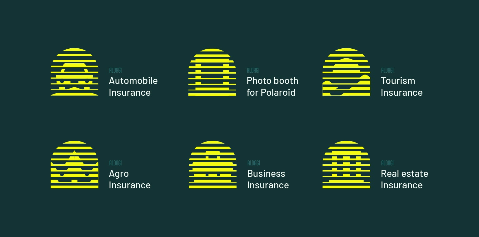
Ketevan Magalashvili: Since its founding, Aldag has updated its brand several times. In 2013, the main symbol appeared as a window, which changed over time and evolved around certain ideas. This year, when we decided to update the visual style, the task was to maintain the shape of the logo, although we were ready for tangible changes. Obviously, the design process followed the brand strategy, the main message of which is to defeat fears and gain peace of mind through rational mechanisms, with the help of insurance. I think that this is exactly the result we got. The new style accurately expresses our strategic message and includes both the emotional and rational dimensions of our business – on the one hand, we see sunlight, which is associated with a calm mind, emotional balance, and on the other hand, barcode elements, which symbolically embody data, statistical information.
What is the renewed "Aldagi" like as a brand?
Shota Chinchaladze: The strategy is quite deep and multi-layered. So far, the public has only seen the first stage of the strategy, which we started with a conversation about fears. At Aldag, they understand very well that the most precious treasure of modern times is peace of mind and that beyond unforeseen, negative events, this unique resource has many other, everyday enemies, and the strongest among them are our everyday fears. The history of Aldag itself is like this – it began operating at a time when everyone was afraid to take a step and, in general, a sense of security was a rare luxury. Now, we have started to help defeat fears by bringing them to light. It is in this context that Holy Motors has also developed its updated visual identity. Today, Aldag is a brand that fights fears, giving people peace of mind every day. M: How was the visual identity developed? Giorgi Avaliani: The visual language is based on two directions – on the one hand, the window from which the warmth of the sun enters, symbolically, with the glow of sunlight, the fears that prevent us from doing anything disappear, which are precisely when we hide in the corners of our minds. On the other hand, there was a rational approach to the work of the “Aldagi” team itself, which was also reflected in the visual identity. There are also changes in the brand’s color scheme – warmer colors entered the palette and reflected the sunlight entering the window.
What was the work process like?
Shota Chinchaladze: The most interesting thing I heard from the Aldagi team itself was what they had a very clear idea of – what are we for? What is the purpose of the brand? Understanding this purpose is crucial in an industry like this. At the very first working meeting, the words were uttered that later became the brand’s purpose statement: Since the day of our foundation, we have been conquering fears and empowering individuals, businesses and society every day. We can say that these words have become one of the main foundations of the brand’s new strategy. Ketevan Maghalashvili: I think the brand’s identity is now much more pronounced. During the work, Shota researched how the brand is perceived by employees, what is the history of the brand itself, how people see the brand, what content and values Aldagi carries. It was based on these insights that the new brand strategy was created.
Celebrate the renewal with a campaign. How was "The End is Good" created?
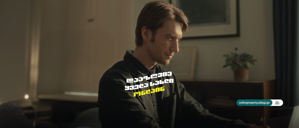
Ketevan Maghalashvili: In accordance with the new brand strategy, the visual style update was followed by a creative campaign, which we planned together with JWT Metro. Based on the brand message, “With a Peace of Mind” was supposed to be the main slogan of the campaign, however, after much discussion and deliberation, we decided to take the wording in a more creative direction. This is how the campaign message “The End is Good” was created, together with the JWT Metro team. Such a rational product, like insurance, is conveyed so simply and simply that I think it is understandable and acceptable to everyone. This is also evident from the feedback.

